A Visual Sanctuary for Higher Consciousness
When renowned actor Jeffrey Bowyer-Chapman stepped into the wellness space to establish his custom trance channeling and spiritual guidance practice, Middle Frequency, he required a visual identity that echoed the depth of his energetic work. The objective was to create a cohesive brand—encompassing an editorial web presence, fluid identity marks, and a dynamic asset suite—that fuses transcendent, modern spirituality with a welcoming, sophisticated approach.
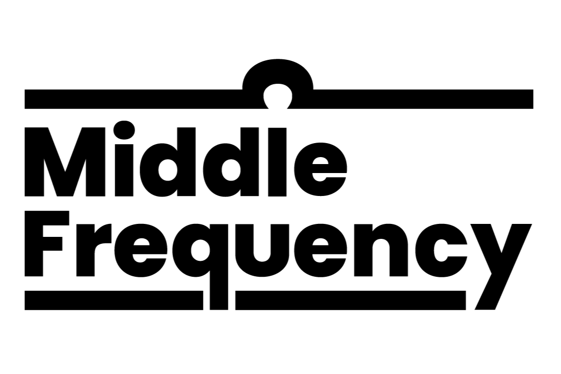
Combination Mark: To distance the brand from typical New Age aesthetics, the main mark reinterprets Jeffrey's astrological sign, Libra, into a sleek, modern visual framework. • Typography & Alignment: The brand name is centered between the parallel lines of the Libra symbol using Poppins. Chosen for its monolinear weight and geometric roots based on pure circles, the typeface acts as a visual anchor for the concept of equilibrium. • Structural Narrative: The top framing stroke remains completely continuous, while the baseline is physically fractured by the descending tails of the "q" and "y" in "Frequency." This intentional break visualizes an energetic disruption, illustrating what happens when one detaches from intuition and mindfulness.

Colour Palette: A foundational palette of sage green, terracotta, ivory, and black, curated to directly emphasize the grounding, real-world nature of Jeffrey’s practice. By anchoring the brand in rich earth tones, the palette establishes an immediate sense of stability and accessibility for those interested in engaging with energetic work.

Sub-Brand Wordmark: Designed for Jeffrey’s Karmic Cycle Coaching Session, the Looped wordmark fits seamlessly into the Middle Frequency brand while maintaining a distinct identity. Retaining the geometric Poppins typeface for continuity, the mark features a custom typographic modification where the overlapping "O"s form an infinity symbol. This subtle transformation introduces a sleek visual hook that elegantly communicates the karmic loop concept of repeating patterns of events, emotions, and relationships.
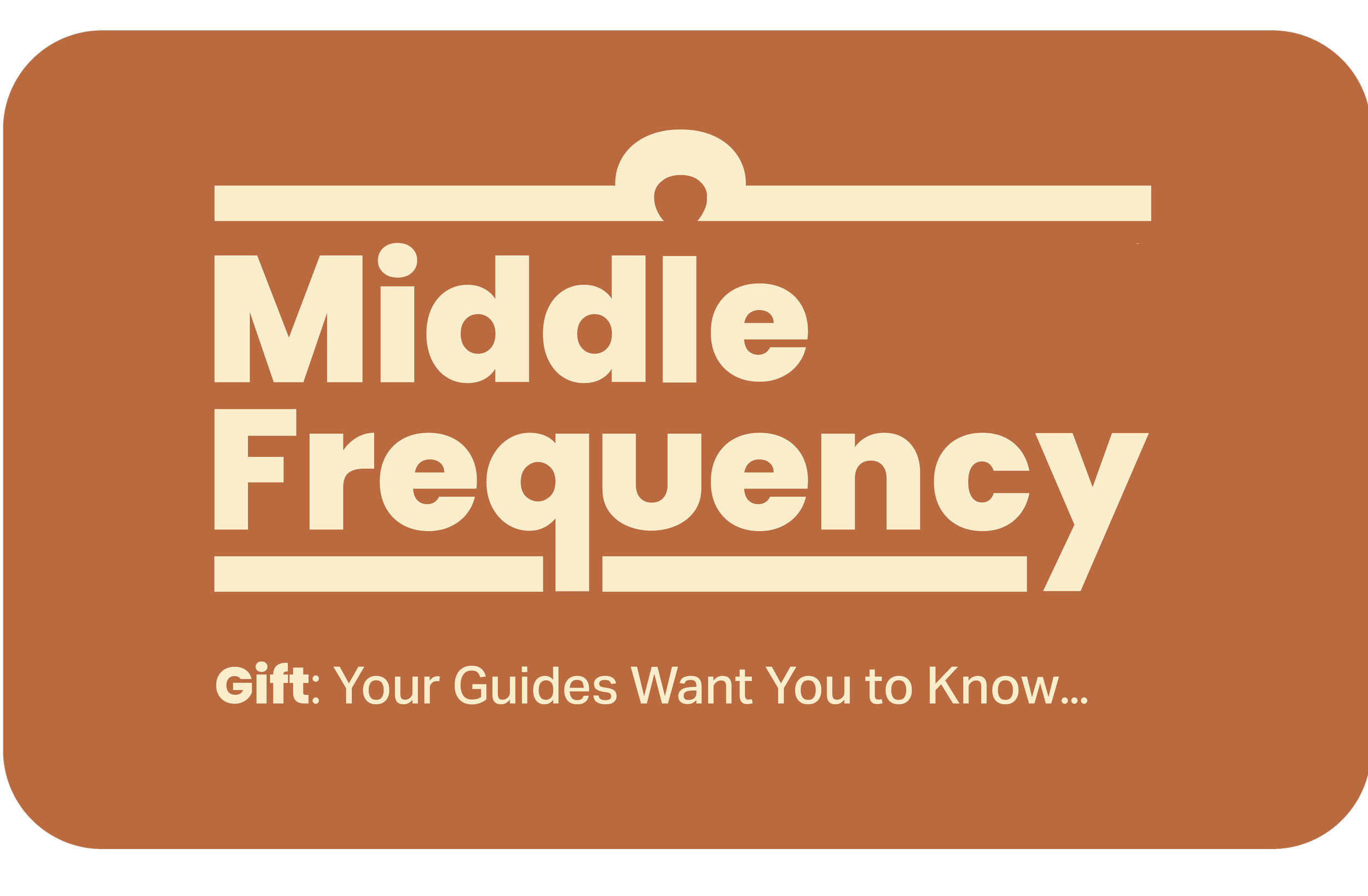
Applied Design: The Middle Frequency e-gift card translates the brand’s visual identity into a seamless digital experience. By pairing the full combination mark with the striking tagline, "Your Guides want you to know...", the layout is optimized specifically for screen readability and premium digital delivery. The composition ensures that the brand's elegant, guided message remains impactful and visually striking when arriving directly in a recipient's inbox.
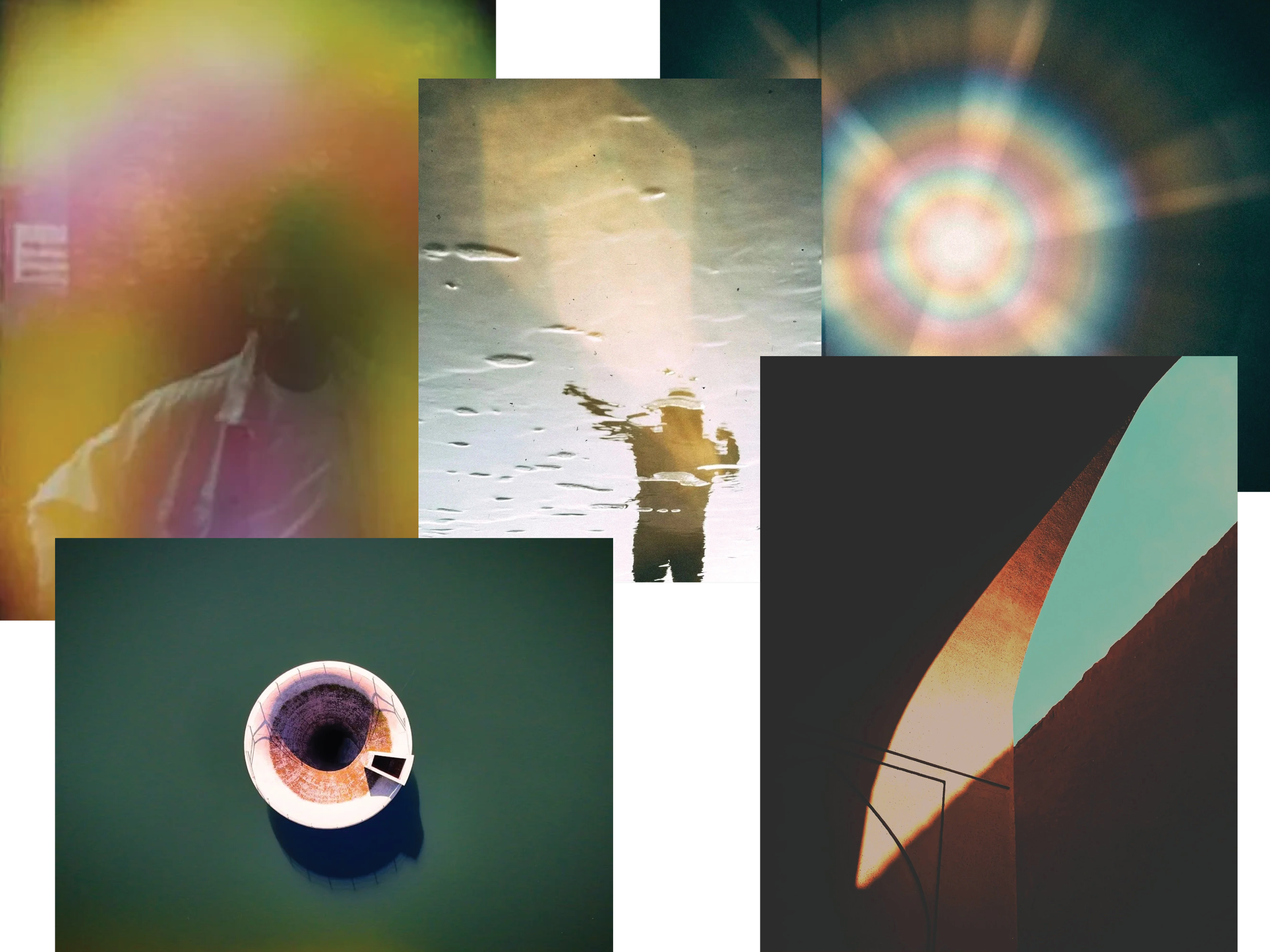
Visual Assets + Textured Gradients: fluid, ethereal aura gradient matrix utilized across background textures and images in the web design and social media assets. This dynamic digital treatment serves as a distinct visual cue that separates Middle Frequency from traditional, cliché metaphysical offerings, bringing a sharp, contemporary aesthetic to the user experience.

Pictorial Mark: Middle Frequency’s pictorial mark distills the brand identity into a single, highly recognizable icon. The elongated Libra sign symbolizes both balance and frequency. Versatile by design, it seamlessly adapts to various formats, from a website favicon to subtle branding on social media assets and other marketing collateral.
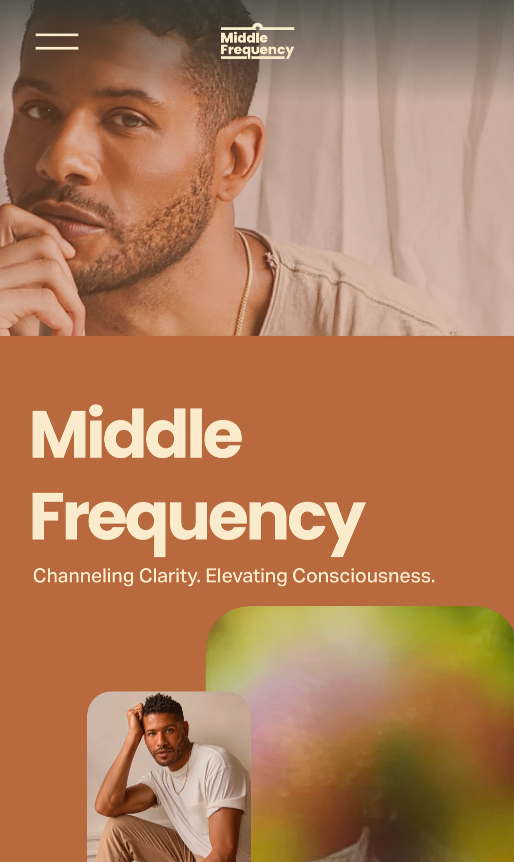
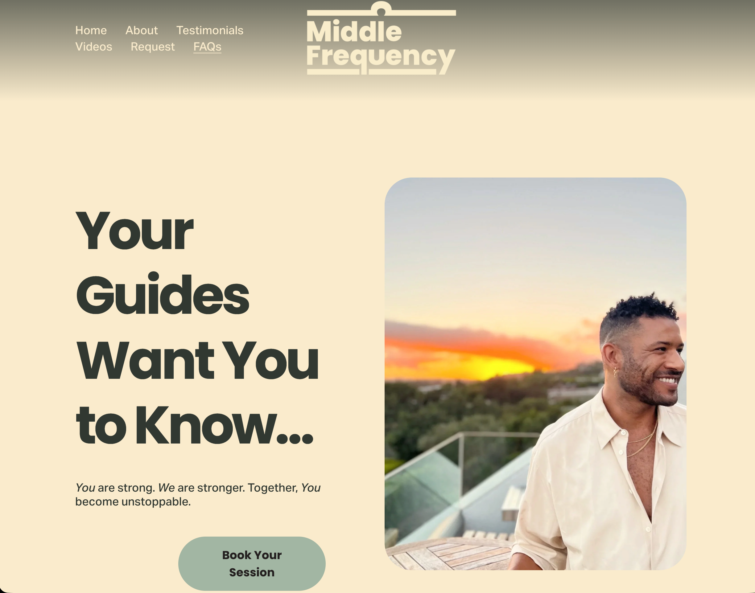
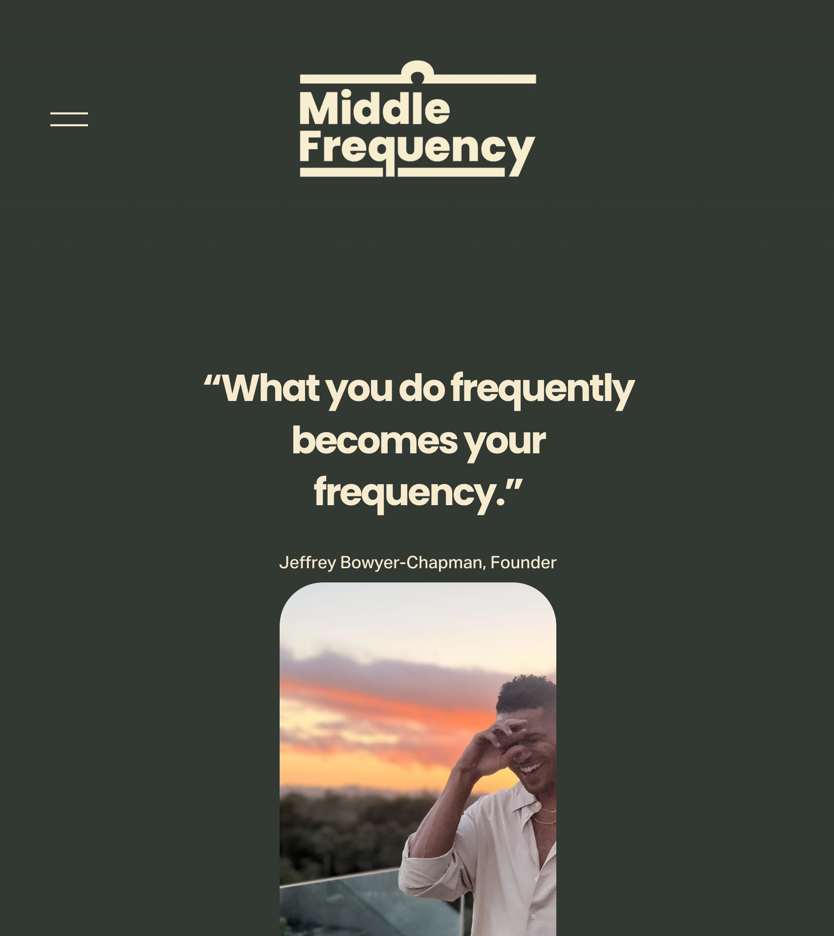
Website & Digital Experience
Designed to serve as both an informational hub and an active booking space, middlefrequency.com balances sleek functionality with a premium editorial feel. The responsive interface utilizes a structured layout that grounds the fluid gradient assets, framing Jeffrey's offerings within a sophisticated digital environment. The result is an intentional user journey that moves seamlessly from brand storytelling to direct client conversion.