A Visual Framework for Culinary Storytelling
This branding project honours Joie Alvaro Kent’s rich Filipino heritage and deep reverence for the written word through an intentional, editorial design framework. Influenced by structural architectural forms, the brand package balances a clean, minimalist aesthetic with an understated palette of soft, muted West Coast hues. The website acts as a grounded yet elevated space to present her multifaceted culinary and literary career.
Monogram + Wordmark: The visual identity for Joie Alvaro Kent pairs a clean, modern wordmark with a sophisticated monogram to reflect her notable status as an award-winning cookbook author, food writer, and culinary judge. The sleek, thin-weight sans-serif font brings a refined, modern aesthetic that lends immediate editorial credibility to the brand. To construct the bespoke monogram, the letterforms were carefully customized—modifying alignments, adjusting the negative space, and altering shapes to ensure structural harmony. This minimalist lettering acts as a versatile signature icon, distilling her multifaceted literary and culinary career into a timeless, premium mark that feels both authoritative and deeply personal.
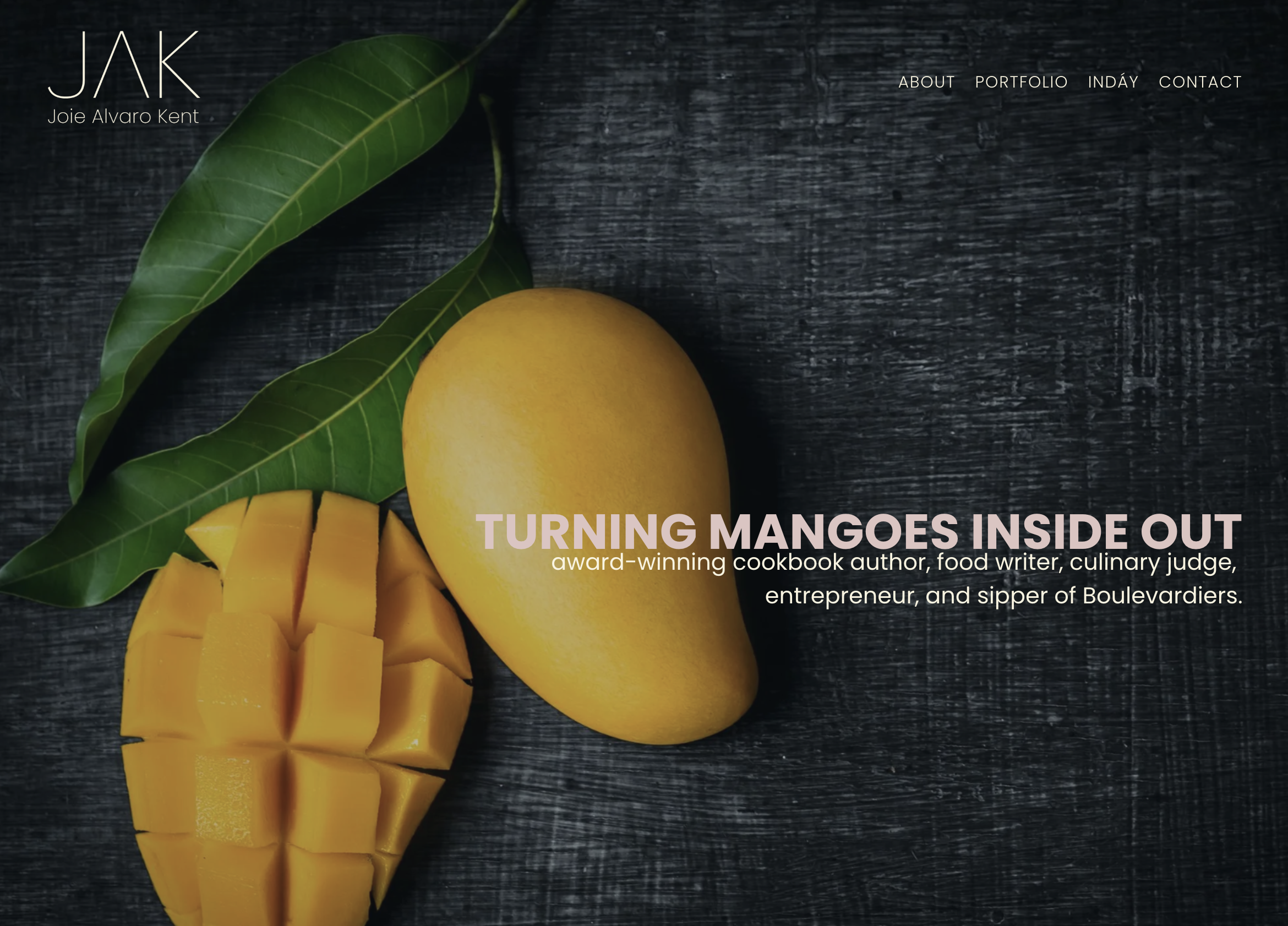
Website: The portfolio website design serves as a dynamic, editorial-driven archive of Joie Alvaro Kent’s culinary journalism and cookbook projects. Optimized for seamless navigation, the layout organizes prestigious book releases, food journalism, and judging highlights into a clean grid that mirrors an online food magazine. The homepage prominently features the tagline, “Turning Mangoes Inside Out,” which serves as a dual metaphor. It honours her Filipino upbringing—recalling childhood memories of flipping mango skins to savour every last bit—and represents her editorial approach of digging deep to extract personal stories from chefs. Ultimately, the design balances culturally grounded storytelling with a professional showcase that instantly engages readers, publishers, restaurateurs, and media partners.
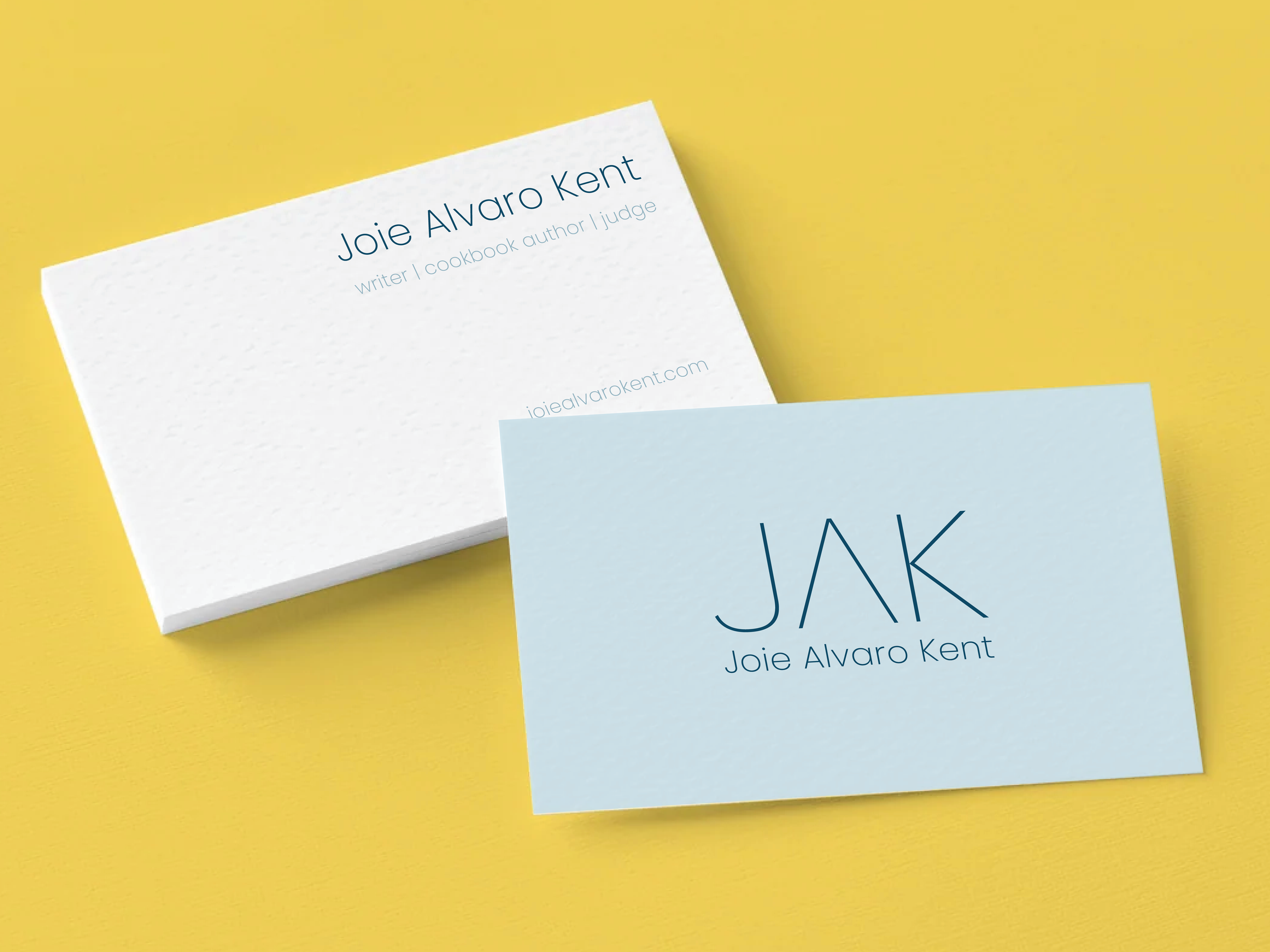
Applied Design: The business card utilizes the simple elegance of the monogram on premium, textured linen cardstock to present Joie Alvaro Kent with minimalist sophistication. Bathed in soft, muted West Coast shades of blue, the layout balances the ultra-clean, light sans-serif typography with ample negative space to echo the quality feel of a luxury publication. The design ensures her contact details and core pillars—author, writer, and judge—are presented with crisp, structural hierarchy, leaving a lasting first impression within the culinary arts community.